Here's a test that takes four seconds.
Cover the logo on your website and read the page. Would anyone know it was your company? For most businesses the honest answer is no — and that isn't a design failure. It's a scope one.
Most companies that say they've "done their branding" bought a logo. That's a legitimate purchase and often exactly what was asked for. But a logo is one file, and a brand identity is the set of rules that makes every future file agree with it. Knowing which one you have explains a lot of quiet frustration.
There is a third thing underneath both, which we argued in why your brand needs a logo: the brand itself is what people expect from you — whether you deliver when you said you would. This article is about the layer in between, the visual system that carries it.
What a logo gives you
A mark, usually in a few formats, sometimes with one or two colours specified. It's the signature at the bottom of the page.
That's genuinely useful. You can put it on a sign, a card and a website, and you'll be recognisable in the places it appears.
What it doesn't give you is any instruction for everything the logo doesn't touch — which is almost everything you produce.
What a brand identity gives you
- A colour system, not a colour. Exact codes for print, screen and web, plus rules about proportion: which colour dominates, which supports, which is used sparingly for emphasis. Without this, one designer uses your blue at 70% opacity, another picks a slightly different blue from a screenshot, and within a year you have four blues.
- A typography hierarchy. Which typeface for headlines, which for body, what sizes, what weights, how they relate. This is what makes a document you've never seen before look like it came from your company.
- Usage rules for the mark. Clear space around it, minimum size, what it can sit on, and specifically what not to do — stretched, recoloured, placed on a busy photo, reconstructed by someone who only had a JPEG.
- A visual language. Layout principles, how images are treated, any graphic devices that belong to you. This is the part that makes a post recognisable even with the logo cropped out.
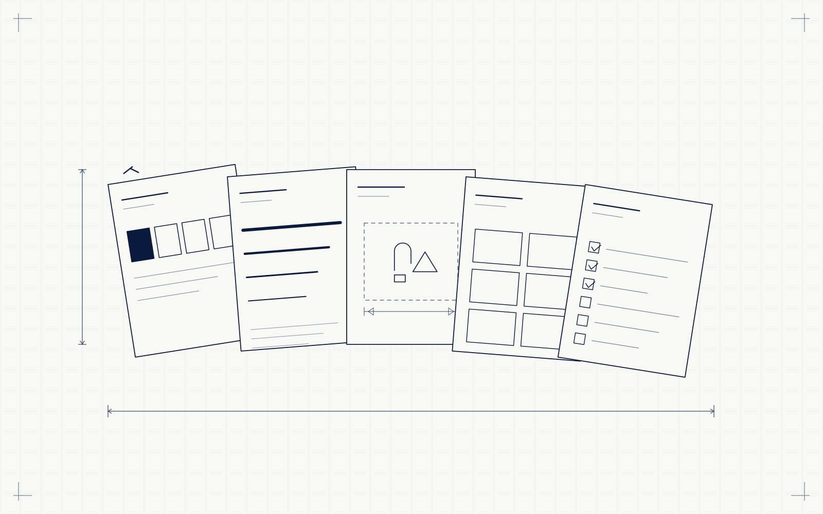
- Templates. Letterhead, proposal, invoice, presentation, social post. The documents you actually send, built so nobody has to design them from scratch at 11pm.
- A written document. All of the above, recorded somewhere a new employee, a freelancer or a printer can follow without asking you.
Why the difference shows up as inconsistency
Without written rules, every new piece is a guess.
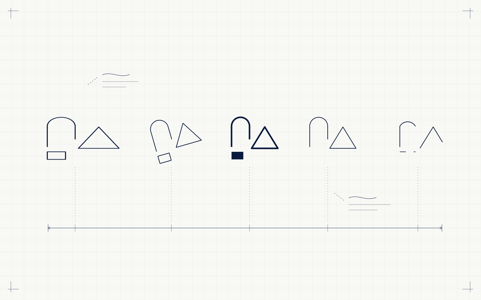
Your designer guesses. The intern making an Instagram post guesses. The printer producing your signage guesses. The freelancer building your exhibition stand guesses. Four people, four reasonable guesses, four slightly different versions of your company.
Nobody did anything wrong. Nobody was ever told what right looked like.
That's why the frustration is so hard to articulate — the usual complaint is "everything looks a bit off" rather than anything specific. The cause isn't talent. It's the absence of a shared reference.
Which one do you actually need?
Be honest about the stage you're at.
A logo is enough if you're one or two people, producing everything yourself, and consistency lives naturally in your own head. Buy a good mark, keep it simple, move on. There are more useful things to spend on right now.
You need the identity system when more than one person makes things. The moment a second person — an employee, a freelancer, an agency, a printer — produces something with your name on it, the rules stop being a luxury and start being the thing that prevents drift.
You may need a rebrand only if the mark itself no longer fits: the business changed direction, the name changed, the design is genuinely dated, or it doesn't work in the places you now need it. Wanting consistency is not a reason to redraw the logo.
The cheapest version of this that works
If budget is the constraint, you don't have to buy everything at once. In order of return:
- Write down the colours. Exact codes, and which is primary.
- Choose two typefaces and record where each is used.
- Set clear space and minimum size for the logo, and list two or three things nobody should do to it.
- Build three templates — the proposal, the invoice, the social post.
- Put all of it in one document and send it to everyone who makes anything.
That's a few pages, and you can write it yourself. It won't be as considered as a full identity system, but it solves the majority of the inconsistency problem for almost nothing. We'd rather tell you that than sell you something you're not ready for.
What we'd do with an existing logo
A common situation: the mark is fine, everything around it is missing. You don't need to start again.
We build the system around what you already have — colour, type, usage rules, templates, guidelines — and keep the logo. It's a smaller, cheaper project than a rebrand, and it fixes the actual problem. If the mark genuinely doesn't work, we'll say so, but that's rarer than agencies suggest.
How we work
Strategy before marks. We agree what the brand has to communicate and to whom before designing anything, because a mark that looks good and says the wrong thing is a more expensive mistake than one that's simply plain. For The Virtual Greens, an indoor golf lounge in a category its market had not seen before, that meant an identity built to explain a first-of-its-kind venue rather than decorate it.
You see two or three genuinely different directions with the reasoning behind each — not twenty variations of one idea. You choose one and we develop it properly. Then we write it down, hand over editable source files, and you own everything outright. That is what our branding work is scoped to deliver.
The short version
A logo is a file. A brand identity is the rules that make every future file agree with it.
If one person makes everything, a logo may be all you need. If more than one person does, you need the rules — and you may be able to write the first version of them yourself this week.
Cover your logo and read your homepage. That answer tells you which conversation you're having.