Most arguments about a logo are really arguments about taste. The owner wants blue, the nephew who did the design school course wants something modern, and somebody's wife has strong views about the font.
None of that is the question. The question is whether a customer who saw you once will recognise you the second time, on a screen the size of a thumbnail, six weeks later. That is the job. Everything else is preference.
What does a logo actually do for a business?
It shortens the time between seeing you and remembering you. That's it.
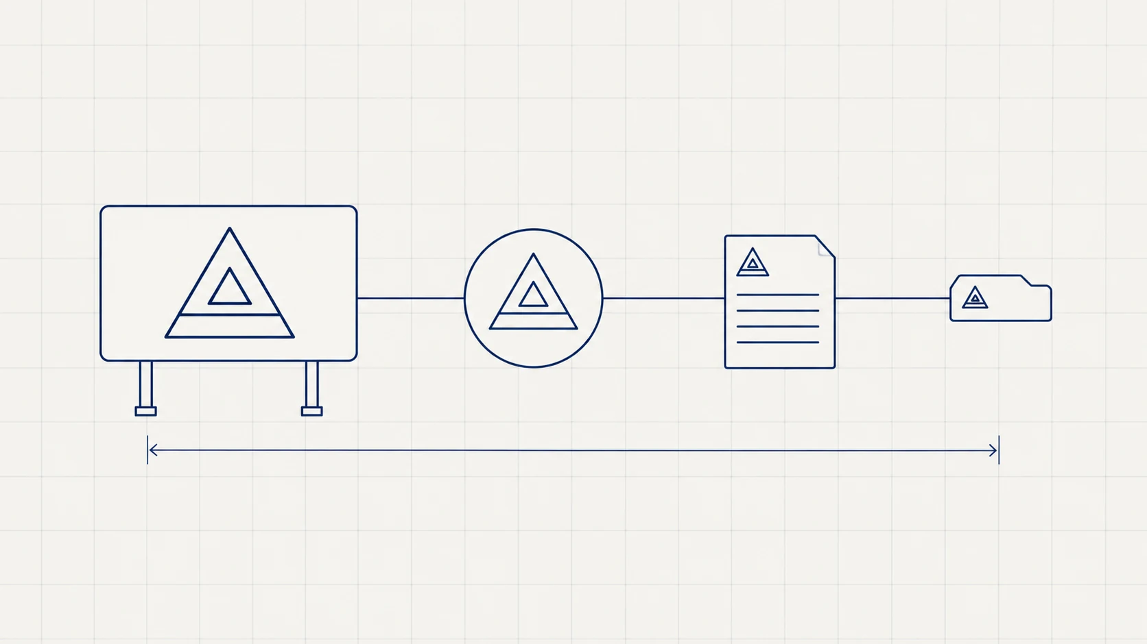
A customer meets your business in fragments — a delivery van, a WhatsApp display picture, an invoice, a board above a shop, a tab in a browser. None of those fragments is enough to hold a whole impression on its own. The logo is the thread that ties them into one business in the customer's head instead of five unrelated encounters.
That recognition does real work. It's why an unfamiliar quotation on a properly-marked letterhead feels safer than the same numbers in a bare email, and why a delivery from a van with a name on it feels like a company rather than a man with a vehicle. You are not buying beauty. You are buying the assumption that you'll still be here next year.
Is a logo the same thing as a brand?
No, and confusing the two is the most expensive mistake in this whole area.
The brand is what people expect from you: how you answer the phone, whether you deliver when you said, what your prices mean. The logo is a label on that. A good mark on a business that misses deadlines just makes the disappointment easier to recall.
Which is also the honest reason to keep logo spending proportionate. It is the cheapest part of a brand and the part most argued about, usually in inverse proportion to how much it decides.
What makes a logo work, practically?
It survives being shrunk, cropped, printed badly and reproduced by people who don't care.
Five tests, and a mark that fails them will cost you money quietly for years:
- The thumbnail test. At 24 pixels — a browser tab, a WhatsApp display picture — is it still identifiably yours? Fine detail, thin lines and three words of tagline all disappear here.
- The circle test. Social platforms crop to a circle without asking. A wide horizontal lockup loses its ends.
- The one-colour test. Invoices, rubber stamps, a newspaper insert, a fax from a government office. If the mark only works in gradient, it breaks the moment it leaves your control.
- The distance test. A signboard is read at twenty feet by someone driving. Whatever survives that is your real mark.
- The embroidery test. Staff shirts, caps, awnings. Thread cannot do fine gradients or hairlines.
The common failure in Indian small business is the opposite of ugly: it's busy. A mark carrying an icon, the full company name, a tagline and an established-in year does all five tests badly. The usual fix is a compact symbol that works alone, plus a full lockup for wide spaces — two versions of the same identity, used in different places.
What files should you get from a designer?
All of these, before you make the final payment. This list is the single most useful thing in this article.
| What you get | Why it matters |
|---|---|
Vector master (.ai, .eps or .svg) |
Scales from a visiting card to a hoarding with no loss. Without it you are stuck |
| PNGs with transparency, several sizes | Day-to-day use on documents and social |
| One-colour and reversed versions | For stamps, dark backgrounds, single-colour printing |
| Favicon and app icon | The 16–512px versions nobody remembers to ask for |
| Colour codes: HEX, RGB, CMYK, Pantone | So your printer, your signboard maker and your website agree |
| Font names and licences | Using a font you don't hold a licence for is a real liability |
| A one-page usage guide | Minimum size, clear space, what not to do |
| Written transfer of copyright | See below |
If your only copy of your logo is a JPEG someone sent on WhatsApp, you do not have a logo. You have a picture of one. The first signboard maker who needs a vector will charge you to redraw it, badly.
Who owns your logo?
Not you, unless it says so in writing. Under Indian copyright law the author of an artistic work is its first owner — that is the designer, not the person who paid for it, unless there's an agreement assigning the rights.
So get one line in the invoice or contract assigning copyright in the final artwork to your company on payment. This costs nothing at the time and is nearly impossible to fix years later when the designer has moved, changed careers, or wants a fee to release the files.
Separately: a trademark is a different thing from copyright. Registering your mark under the Trade Marks Act is what stops a competitor using something confusingly similar, and it's worth doing once the business has something worth defending. Check the current fees and process on the official IP India site before budgeting, not from a blog.
What does a logo cost in India?
Market ranges in 2026, for context rather than as our rate card:
- ₹2,000 – ₹10,000. A marketplace or fiverr-style freelancer. You'll usually get a picture, not a system, and often no vector or rights.
- ₹15,000 – ₹75,000. A designer or small studio doing it properly: a few routes, the full file set, the usage rules.
- ₹75,000 – ₹3 lakh+. A full identity — naming or naming review, the mark, typography, colour, stationery, signage, packaging and a guideline document.
The thing that actually varies isn't the drawing. It's how much of the system comes with it, and whether anyone thought about where the mark has to live.
When should you not spend money on a logo?
Three cases, honestly.
When the business hasn't settled. If what you sell may change within the year, you'll be paying twice. A clean wordmark in a good typeface will carry you until the business is decided.
When it's not what's holding you back. If enquiries are arriving and you're losing them on response time or price, a new mark fixes nothing. We've told people this and lost the work — it was still the right advice.
When yours is merely unfashionable. Recognition compounds. A dated mark that customers already know is often worth more than a fresh one nobody does. Redraw before you replace.
How do you know when yours has stopped working?
Look for the symptoms, not the styling.
- Your team can't find the right file, so different versions circulate.
- It's been redrawn by a signboard maker or printer, and now several versions exist in the world.
- It fails the tests above — especially the circle and the thumbnail.
- It says something the business no longer does. A mark built around one product when you now sell four.
- You hesitate to put it on something expensive.
That last one is the most reliable signal there is. If you wouldn't put it on the side of a vehicle you just paid for, it isn't doing its job.
A logo is a small purchase that gets touched by every other thing you spend money on — signage, packaging, uniforms, the website, the invoice. That's the actual argument for doing it once, properly: not because a mark makes a business, but because everything else in the business ends up carrying it.